

Ra11y for a Consistent ServiceOntario Experience
Visual Design, UX, & Research
My Role
Academic research, ethnographic research, user journey mapping, persona building, prototyping, generating English & French transcripts
Tools Used
User journey, empathy mapping, Microsoft Inclusive Design Kit, Adobe Illustrator, Adobe XD, Adobe Audition, Adobe PDF Accessibility Checks
My Team
Shivangi Patel, Kaspar So, and Demi Peppas
Timeframe
2 months
Background
Target Audience: Ontarians, as defined for this project, is anyone that is anyone residing in Ontario that may need ServiceOntario’s services, regardless of age or ability
Focused on Ontarians with permanent visual / hearing disabilities, extending to Ontarians with able bodies
Ontarians with situational (e.g. ear infection) and temporary (e.g. listening to loud music) disabilities were also part of the consideration
Problem / Why?
ServiceOntario centres are a gateway for services that are mandatory for all Ontarians. Looking to design for accessible navigation for the largest amount of people, government services present this opportunity, especially given their supporting infrastructure. With ServiceOntario centres being mostly privately owned, and an inconsistency in terms of layout and technologies used, there is no streamlined experience from one centre to another. Combined with each centre offering a different set of services, users find themselves frustrated when they arrive at a centre that doesn’t offer their desired service.
Opportunities
How might we reduce frustration when visiting a ServiceOntario?
How might we help Ontarians in getting their desired services?
Reviews on 2 ServiceOntario Centres


Design Process / How?
Conduct onsite research and observations
Research activities: Academic research, onsite research, and interviews with Ontarians
Phase results: In the face of inefficiency and indignity, some Ontarians walk in and out of ServiceOntario centres irritated. This project will aim to change Ontarians’ perceptions on ServiceOntario by making their experience enjoyable.
Map out the original user journey with pain points
Research activities: Follow-up interviews with Ontarians, empathy mapping, user journey mapping
Phase results:
(Simplified) User journey for Carl with visual / hearing (permanent, situational, temporary) disability who needs to renew his health card -
(1) Walk into a ServiceOntario, is this a a centre with health card renewal services?
(2) Where are the accessibility seatings while I wait?
(3) Where are the health card renewal forms?
(4) Which service counter should Carl go up to for health card renewal?
(5) Served by a SericeOntario employee
(6) Leaves ServiceOntario
Pain points -
Most locations are privately owned, centres’ layout such as lineup system and signage differ between locations, confusing Ontarians whenever they visit a different location
Extended wait times because some customers do not having the right documents on hand, went to the wrong centres / service counters
Priority seatings are not clearly indicated in some centres
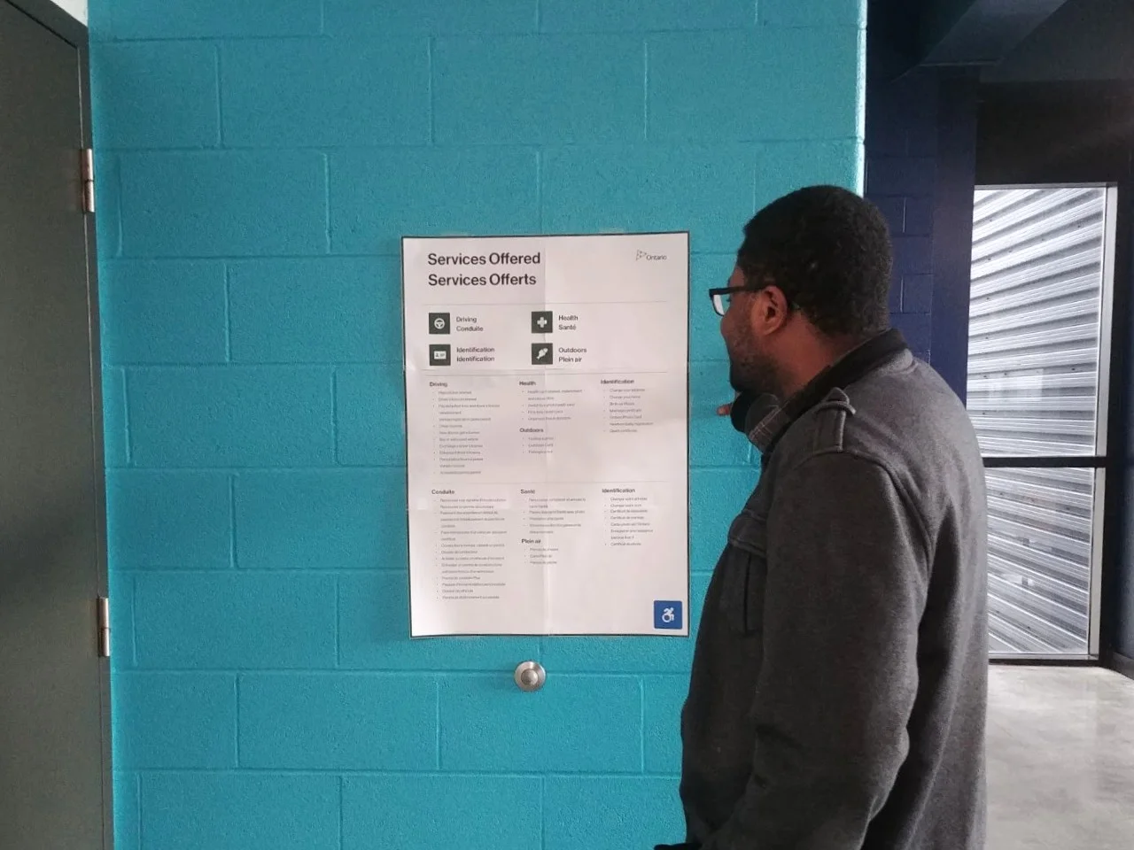
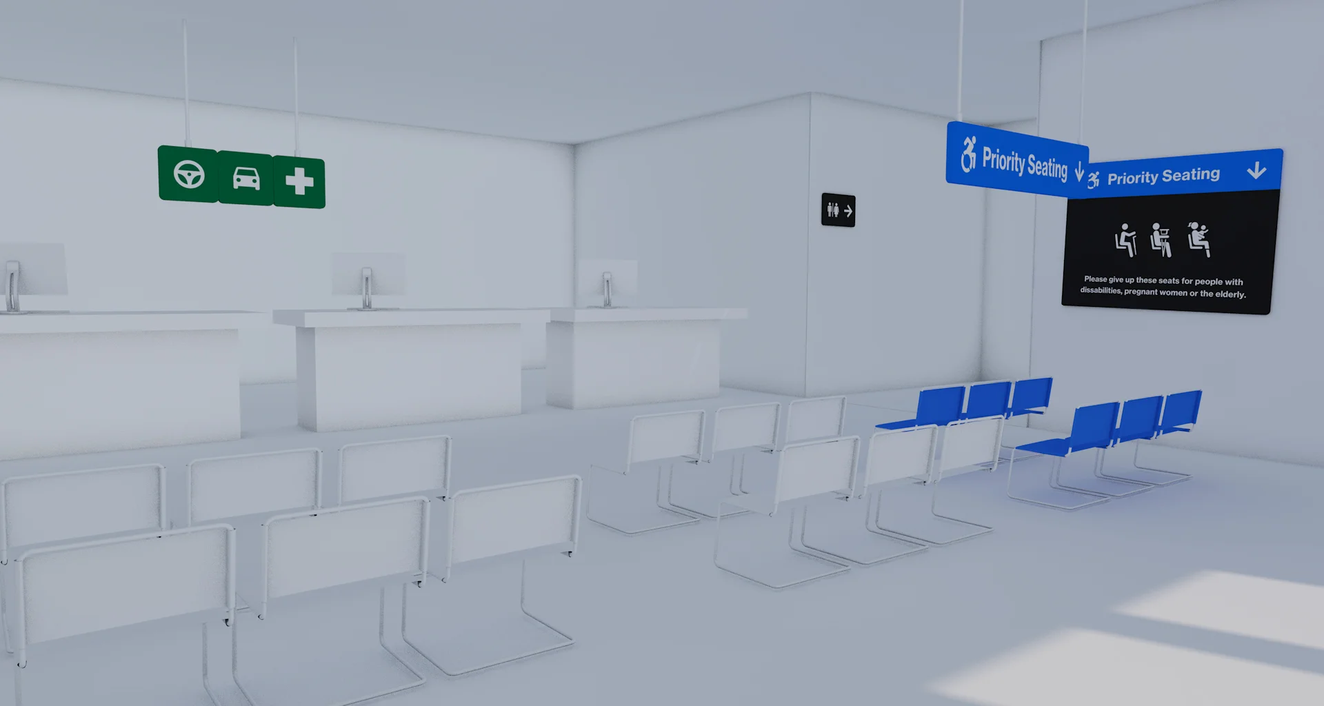
Narrow down: a visual framework of accessible and consistent signage
Phase results: Designed a visual framework consisting the following signage - (1) accessibility seating, (2) outdoor signage, (3) ServiceOntario services iconography, (4) application forms counter.
Map out an IMPROVED user journey with the proposed visual framework throughout ServiceOntario centres
(Simplified) Improved user journey for Carl with visual / hearing (permanent, situational, temporary) disability who needs to renew his health card -
(1) Outside a ServiceOntario, reads Outdoor Signage to confirm that health card renewal is available
(2) Walks in, looks for the Accessibility Seating Signage to take a seat while he waits
(3) Looks for the Application Forms Counter to take a package of health card renewal forms
(4) Looks for the Health Card Iconography above the specific service counter
(5) Served by a SericeOntario employee
(6) Leaves ServiceOntario
Establish success metrics of the visual framework
Phase results:
Signage(s) confirms that this location offers what Ontarians are looking for
Signage(s) leads Ontarians to accessibility seatings
Signage(s) directs Ontarians to the application form counters to find the applications forms they need
Signage(s) indicates clearly to Ontarians where to line up for the services they are looking for
Signage(s) gives Ontarians confidence in knowing what to do / where to go when walking through the centre
Conduct user testing with Ontarians
Research activities: Invited a number of Ontarians, prepared signages, a pre-test questionnaire, hypothetical scenarios (e.g. find the accessibility seating), and a post-test questionnaire
Phase results: Signages are very easy to read. Could potentially develop another series of floor signage.
Onsite Research


A - Activities
Looking for specific service counters for specific services (e,g. drivers’ license renewal)
Getting a ticket in the queue
Waiting for a turn / to be called
Being served at a service counter
Using a self-serve kiosk
E - Environment
See sketch!
I - Interactions
Ontarians with ServiceOntario employees
Ontarians using the self-serve kiosk
Ontarians with Ontarians
O - Objects
Chairs
Service counters
Line stanchions
Some centres with accessible ramps, some without
U - Users
Ontarians with abled bodies
Ontarians with mobility, visual, and hearing impairment
Ontarians with
User Testing


Final Prototype(s) / What?


What did I learn?
This project forces me to rethink the ‘wheelchair’ icon on the automatic doors. Why must we label those who use this automatic door as people with accessibility needs? Not just the people on wheelchairs, anyone whose hands are full, or with a broken arm, could take advantage of an automatic door.
This project is an excellent example to illustrate why certain designs are not always the most aesthetically-engaging. Given the broad range of target audience, from an abled body Ontarian, to those with visual impairment, the solution delivered is only effective if it is on par with accessibility standards, aka sharp contrasts and legible fonts.
What would I have done differently?
If given more time, our team would invest time in developing floor signage, such as arrows.
If possible, we would like to prototype our signage at a ServiceOntario centre