Modernizing Ontario Newsroom — a solution for all Ontario Subscriptions
Role (Project UX lead)
Design and business strategy
UX and market research
Service design
Product design
UX/UI design
Content design
Usability testing
Frontend development
Accessibility testing
Ongoing refinement based on user feedback
Tools Used
Figma
HTML, CSS, SASS, JavaScript, Bootstrap, Angular 5
WAVES Web Accessibility
HTML Code Sniffer
BrowserStack
GitLab
My Team
Backend Developers
DevOps
Data Scientists
Product Owner
Duration
8 months
Background
Setting: The Ontario Cabinet Office, Tech and Delivery Team
Target audience
Phase 1: Ontarians looking to personalize Ontario News subscriptions
Phase 2: Ontarians looking to personalize any type of Ontario government communications
Challenge
Ontario Newsroom is a legacy distribution tool created in 2009 as a way to distribute and archive Government of Ontario news items. Although it served its purpose in early 2000s, the data collected was no longer relevant and not aggregated properly to create personalized subscriptions to meet modern business requirements. Thus, the Newsroom Modernization initiative was dedicated to revamping the user sign-up experience in a way that addressed these challenges.
Phase 1: For subscribers of Ontario News
The flow to sign up for subscription was cumbersome. Infrastructure behind email notification needed to be enhanced to match our accessibility guidelines. From a visual and aesthetics perspective, the look and feel of the platform needed to be revamped to maintain consistency with the Ontario Design System.
As we problem-solved for our primary target audience in phase 1, we also looked into how we might repurpose the same solution for other government digital services in Phase 2.
Phase 2: For subscribers of any type of Ontario government communications
With a revamped process to subscribe to government communications, other digital services would benefit by adapting a similar flow. Data collected through this signup form such as subscription preferences would allow us to better anticipate Ontarians’ needs and deliver them information proactively (ex. government services available for business owners).
Solution
A Subscription Platform that
Provides a consistent experience with Ontario government branding
Walks users through 6 simple steps to signup for subscription
Allows high level customization using single-select dropdowns
Improves users’ trust in the system with increased data transparency
Includes a backend administration panel that (1) visualizes aggregated subscriber data, and (2) allows the Tech & Delivery team to easily modify the signup form
Design Process
My Role
As the project UX lead, I directed all aspects of user experience design through all stages of product development. I also designed the backend administration panel and data collection system to aid the team in monitoring the Subscription Platform.
Competitive research
I researched email communications delivered by other jurisdictions, and how their subscriber management tools effectively segmented their subscribers based on demographics and sent them highly customized emails.
Success stories such as gov.uk and usa.gov indicated that emails should be optimized for mobile and tablet interfaces accordingly. Using first party data (data collected directly from the target audience), they were able to identify their subscribers as homeowners, retirees and parents of school-aged children, and sent them personalized emails.
UX research on frontend signup
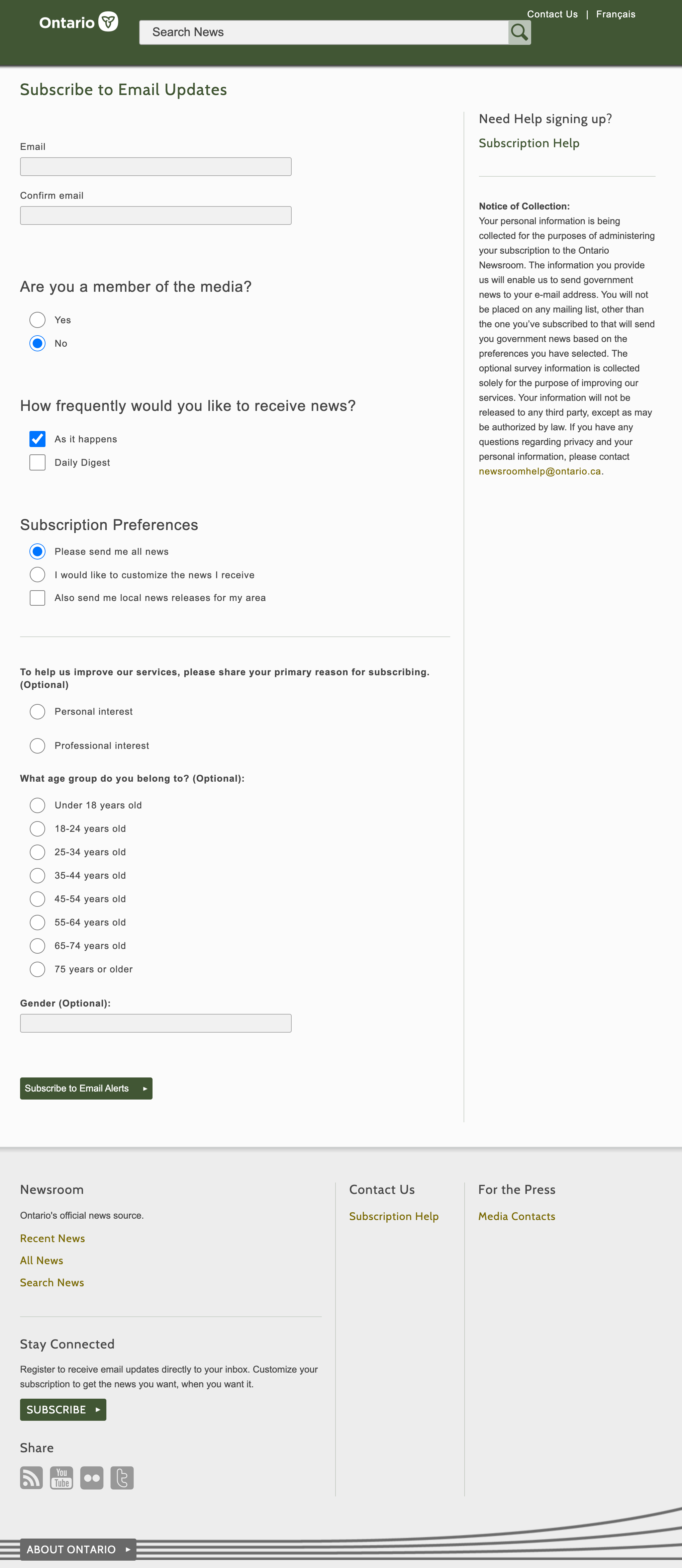
I assessed the current signup process to subscribe to Ontario News and created a user journey map with pain points.


Being a legacy system, there were four major pain points:
Too many steps: could be overwhelming to users, making it difficult to keep track of their information
Lack of high level customization: users were limited to one type of subscription (either news types, ministries or topics)
Outdated and inconsistent layout with the rest of Ontario government branding
Users unclear about what they subscribed to: lacking an overview at the end of the subscription process
To solve the pain points above, I brainstormed four directions to pursue:
Simplified the signup form into 6 distinguishable steps. That way, users would have a good grasp of the entire signup process.
Allow users to subscribe to news across multiple parameters, ex. subscribe to news releases posted by the Ministry of Health regarding Health and Wellness.
The look and feel would be updated to provide users a web experience cohesive with Ontario government branding.
Include a summary page of all information entered into the system towards the end of the signup process for users to review before submitting.
To collect first-party data relevant to high level customization, I also grouped all demographic questions into one of the steps in signup, temporarily known as ‘subscriber profile’.
Planning for user research participant recruitment
After preliminary research, I built three personas:
Hoping to consult users from the public with different experiences, backgrounds and perspectives, I drafted a User Research Plan and Participant Recruitment Package outlining the importance, benefits, and logistics of user research and testing.
Documents in Participant Recruitment Package
Recruitment brief
Consent form
Compensation form
Media release form
Link to user interview questions.
UX/UI design of backend admin panel
Through discussions with the team, I established two key components for the admin panel: analytics and system management.
Data analytics would give the team a comprehensive overview of all demographics, growth of subscribers, email analytics, and a summary of top insights.


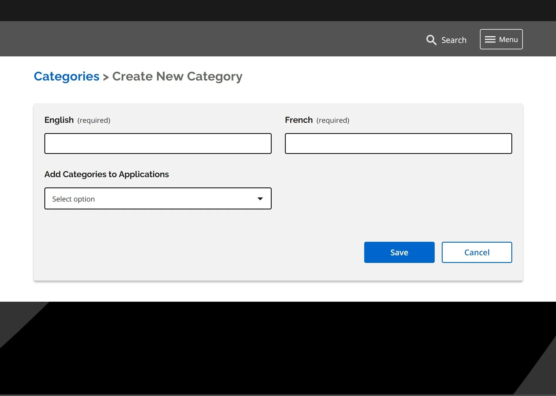
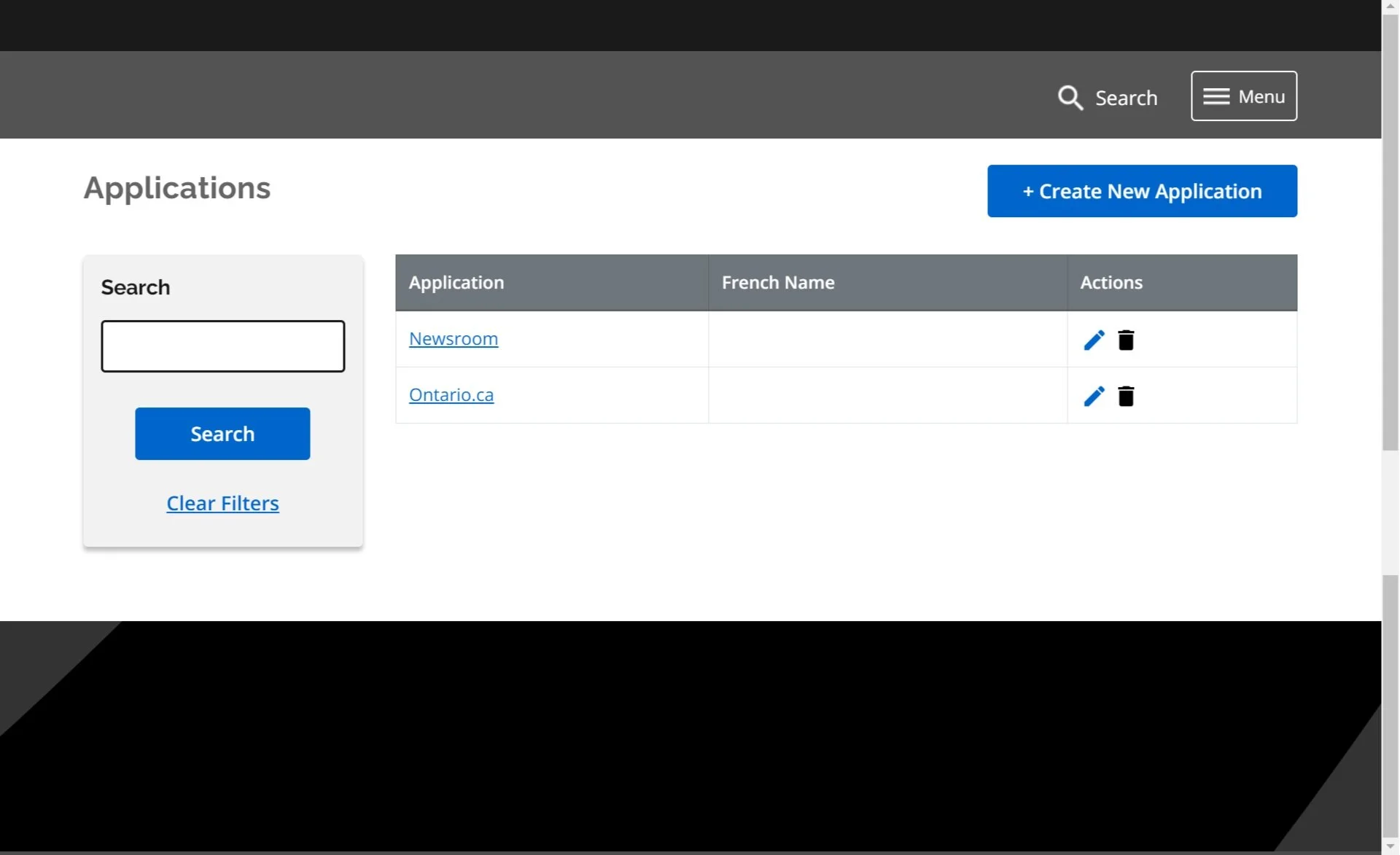
System management allowed developers to easily modify 4 subsections in the signup form: applications, categories, tags, and demographics. Take Newsroom for example, if the team would like to add or remove a parameter for users to subscribe (other than ministries, news types, and topics), they would do so by going to the ‘Categories’ section. They can also edit existing categories.
User testing on signup form with OPS staff
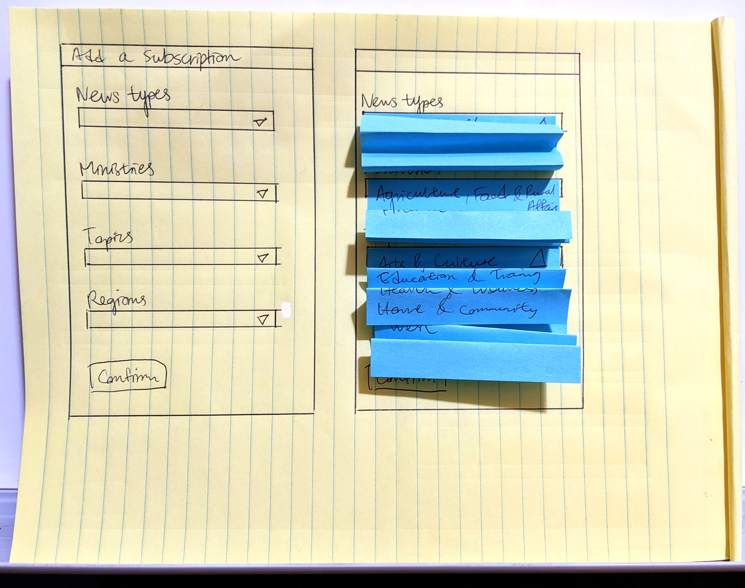
I conceptualized two functionalities that required rapid testing. First, users should have the ability to subscribe to news across multiple parameters (ministries, news types and topics). Second, users should also be able to stack multiple sets of highly customized subscriptions. Two sets of low-fidelity mockups were prepared for users to test.
Since this project was done 100% virtually, paper prototypes were quickly digitized into interactive low-fi mockups.
In a bid to not reinvent the wheel, Prototype 1, based on multiple checkboxes, was designed to be similar to the legacy flow of customizing subscriptions. Inspired by gov.uk, Prototype 2, based on multi-select dropdowns, was brand new to the system.
Participants were instructed to perform a number of scenarios on both sets of prototypes ex. Subscribe to News Releases by the Ministry of Anti-Racism Directorate about Law and Safety. After testing each mockup, they were asked the following questions to test my assumptions:
Looking at the final set of subscriptions, does this match your expectations of what you are subscribing to? Is it intuitive? Any confusion?
Looking at this interface, how clear is it to you that you are able to ‘stack’ multiple subscriptions?
Prototype 1: Customize subscriptions with multiple checkboxes
The process of ‘customizing subscription’ caused confusion especially when users attempted to subscribe to multiple ministries, topics and news using checkboxes. With multiple checkboxes selected (as seen in the mockup below), the majority of the users perceived it to be one big subscription of all feature stories and news releases posted by the Ministry of Anti-Racism Directorate and Finance regarding Arts and Culture and Law and Safety. Though three users appreciated the overview of all checkboxes and options available, it was overall unclear that they were able to stack multiple subscriptions.


Phase 2: Customize subscriptions with multi-select dropdowns
With the multi-select dropdowns, users would be able to select multiple options under each parameter ex. News releases under the Ministry of Health regarding Health and Wellness + Government. Looking at the overview of all subscriptions, users found it clearer than the first prototype that they were able to stack multiple subscriptions. This prototype was well-received by all users who participated in user testing.
Recommendations
Users still need to assume a lot with both prototypes, more instructions such as success/error messages and a summary page of information entered into the system would be ideal.
Manage Subscriptions and Unsubscribe
A similar flow was developed for users to manage their subscriptions and update preferences. Low-fi prototypes were produced and developed in collaboration with developers.
Joint efforts with developers
Based on the improved user journey, developers focused on the functionality while I took the lead in styling and making the platform responsive and AODA compliant.
UI changes made for accessibility
From customized subscription modal to ‘click to expand’
When testing with a screen reader, the screen reader would read all dropdown menu options of ‘Customized Subscriptions’ in a continuous loop, in other words, it would not stop reading until users exited the modal. To resolve this issue, the dropdowns were moved from being stored in a modal to a click-to-expand component.From multi-select to single-select
The vue.js component used for multi-select was not AODA compliant; the screen reader would only read ‘blank’ for each option under the dropdown menus. To compensate for this loss, I discussed with the team and decided to change the component into a single-select dropdowns. This change resulted in users only being able to select one option under each parameter, but it was the most feasible decision at this point of product development.
Testing in staging environment with selected branch staff
On March 29-30, 2021, our team selected several volunteers within the branch of Cabinet Office - Marketing and Digital Strategy to test our signup form and email notification system. The majority of volunteers responded positively regarding the signup and considered it a big improvement from the legacy system.
Limitations and Takeaways
Unable to test with members of the public
Senior Management wanted to err on the side of caution in testing with the public. As a result, I was only able to test with OPS staff.
User testing with a small sample size
Given the tight deadlines during Christmas and the New Year, I was only able to test with a group of six. Testing with a user with accessibility needs would have been a valuable experience for the signup form—a public facing component that should be accessible to all.
What I might have done more of or differently…
I should have started on the content design earlier at the stage of exploring UX/UI for the signup form.
For the users’ convenience, I would propose making the step indicator clickable to provide users another way to go back and forth between steps.
I would continue testing on the user flow of customizing subscriptions. More UX/UI would be required for users to better distinct the path to subscribe to all news vs. customizing subscriptions.


